Your logo on the product — done so it survives contact with reality
Branding is where custom orders succeed or fail. Not because printing is hard, but because buyers and suppliers often mean different things by "print the logo". This page closes that gap: which method suits which artwork, what Pantone really means on fabric, and the checks that stop a wrong-colour shipment.
Every place your brand can appear
Most buyers think of one logo in one place. A custom umbrella carries a brand in up to six places — and each one is a separate decision with its own cost.
| Position | Typical method | What it is good for | Cost logic |
|---|---|---|---|
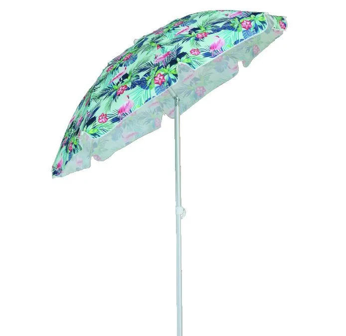
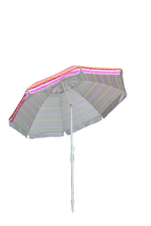
| Canopy panel | Screen print or dye-sublimation | The main branding event — seen from distance, photographed, walked past | Per-colour screens; full-colour designs use sublimation instead |
| All-over canopy | Dye-sublimation | Patterns, gradients, photography, matched brand palettes | No per-colour limit, but needs high-resolution artwork |
| Vent or valance | Screen print | Secondary logo, website, campaign line | Often shares a screen with another position |
| Sleeve / carry case | Screen print or heat transfer | The item the customer keeps after the umbrella itself is gone | Cheap, high visibility, frequently forgotten |
| Hangtag & label | Offset print, woven label, heat transfer | Retail presentation, care instructions, brand story | Per-unit cost is small; setup dominates |
| Packaging | Flexo / offset on carton | Warehouse identification, retail shelf presence, gift presentation | Carton printing is charged per size, not per colour count in most cases |
On golf umbrellas the canopy is the largest single branding surface in the handheld category — a fact promotional buyers use deliberately when a client wants maximum impressions per unit.
Six printing methods, and when each one wins
"Print your logo" is not one process. Choosing the wrong one is the most common cause of disappointed expectations on custom umbrellas.
| Method | Best for | Colours | Durability | Watch out for |
|---|---|---|---|---|
| Screen printing | Flat logos, 1–4 spot colours, large quantities | Per-colour setup | Very good; industry standard for canopies | Fine lines and small text can fill in; gradients not possible |
| Dye-sublimation | Full-colour artwork, patterns, photographs | Unlimited | Excellent — dye bonds into the fibre, does not sit on top | Needs genuine high-resolution artwork; only on polyester |
| Heat transfer | Complex logos on sleeves, tags, small runs | Full colour | Good; edge adhesion is the weak point | Can lift on abrasion; not ideal for canopy panels |
| Pad printing | Small curved surfaces — handles, tips, ferrules | Per-colour | Very good | Image area is small; fine detail limits apply |
| Laser engraving | Wooden handles, metal collars, premium detail | Single tone | Permanent | Only suitable for certain materials and tones |
| Embroidery / woven label | Sleeves, pouches, gift packaging | Thread colours | Excellent | Not possible on canopy fabric; setup cost per design |
A logo with six spot colours costs roughly six screen setups and six print passes. Redrawn to three colours with the same visual impact, it can cut printing cost by a third. We review artwork for exactly this before quoting — not to reduce your brand, but to remove cost that buys nothing.
Pantone references and what they really mean on fabric
A Pantone number is a shared language, not a guarantee. Here is what it does and does not promise when the substrate is umbrella canopy fabric.
What Pantone does deliver
- A single reference everyone can check — printer, dyer, factory and you
- A defined target for the print ink, which is the closest controllable step
- A basis for comparison between proofs from different factories
What it cannot promise
- An exact match between the printed logo and a dyed fabric panel — different colour systems entirely
- Zero variation between dye lots. Batch-to-batch differences of a shade are normal in textiles and are why approved samples are kept
- Identical appearance on pongee, polyester and Oxford — the same ink reads differently on different weaves
How we handle it
Two references, one target
For multi-colour projects we match print to your Pantone and confirm fabric against a physical swatch. Where the two cannot be perfectly reconciled, you see the difference before bulk — not on arrival.
Standard colour as the fallback
If a custom dye lot minimum makes your colour expensive at your quantity, we offer the nearest standard colour and let you decide with the numbers in front of you.
Shade band on the spec sheet
Where exactness is commercially important, we agree a tolerance band in writing before production. This is what serious retail buyers do, and it prevents the argument neither side wins.
Artwork requirements by method
| Method | Format | Resolution | Notes |
|---|---|---|---|
| Screen printing | Vector (AI / EPS / PDF, fonts outlined) | n/a — vector | Minimum line weight and smallest text size are physical limits, not preference |
| Dye-sublimation | Vector or raster | 150 dpi at final print size minimum | Artwork must map to the canopy panel pattern, not a flat rectangle |
| Heat transfer | Vector or high-res raster | 300 dpi at final size | Transparent background; solid shapes preferred |
| Pad printing | Vector | n/a | Small image area — simplify before sending |
| Carton / packaging | Vector with dieline | 300 dpi for raster elements | Barcodes must scan — ask for a test scan before bulk print |
The proofing sequence — four checkpoints before bulk
| Stage | What you receive | What you are approving |
|---|---|---|
| 1. Digital proof | Layout on the product outline, print positions marked | Placement, size, spelling — everything except colour and texture |
| 2. Colour proof / strike-off | Printed swatch or photo under controlled light | Colour against Pantone, coverage, opacity on the actual fabric |
| 3. Pre-production sample | Physical sample of the finished item | Construction, print quality, colour on the real product |
| 4. Signed golden sample | The sample you mark and return, or authorise us to retain | The reference bulk production is inspected against |
Orders without a retained golden sample are the ones that end in "the colour is wrong" disputes with no reference point. It costs nothing to keep one and it settles every future argument — reorders, claims, warranty.
How a wrong-colour shipment gets stopped
The print error that ruins an order is almost never a machine failure. It is a handoff: artwork version B printed against approval A. These are the controls that catch it.
- Single artwork version of record — every revision is numbered and dated; the factory prints only against the approved version
- Two-person artwork check — spelling, Pantone, positions and sizes read by a second person before screens are cut
- Position diagram on the spec sheet — a drawing, not a sentence, showing exactly where each logo sits
- First-off comparison — the first printed piece is compared against the golden sample before the run continues
- In-line print checks — print registration and colour sampled during the run, not only at the end
What we ask from you
- Approve in writing, not verbally — "approved by Sarah, 14 March, v3" is a document; "yes ok" is not
- Tell us immediately if your brand team changes the artwork mid-project — late changes are fine, silent ones are not
- Check the spelling yourself on the digital proof. It sounds obvious. It is the single most common error of all
We tell you before shipment, with photos, and offer the realistic options: rework, partial replacement or a documented discount. What we do not do is ship it and hope the buyer does not notice — that trade has a short memory, and your repeat business is worth more than one carton of umbrellas.
Keeping your design yours
What we do by default
- Quotations and purchase documents carry our own letterhead, never the factory's
- Your artwork is used only for your orders and is not shown to other buyers
- Client-facing details are shared with the factory on a need-to-know basis
- Confidentiality terms are available in the purchase contract on request
What only you can do
- Register your trademark in the markets you sell into — China registration is also possible and often worthwhile once volume justifies it. Domain and trademark are different things; neither protects the other
- Keep your own artwork master files with version history
- For genuinely novel constructions, discuss exclusivity before the first order, in writing — it is negotiable at the start and very hard afterwards
Where a logo actually goes
Print area is limited by panel seams and by the valance. These two show the surfaces most artwork is designed for.
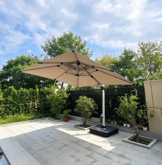
Valance and border — the largest continuous print area on a canopy
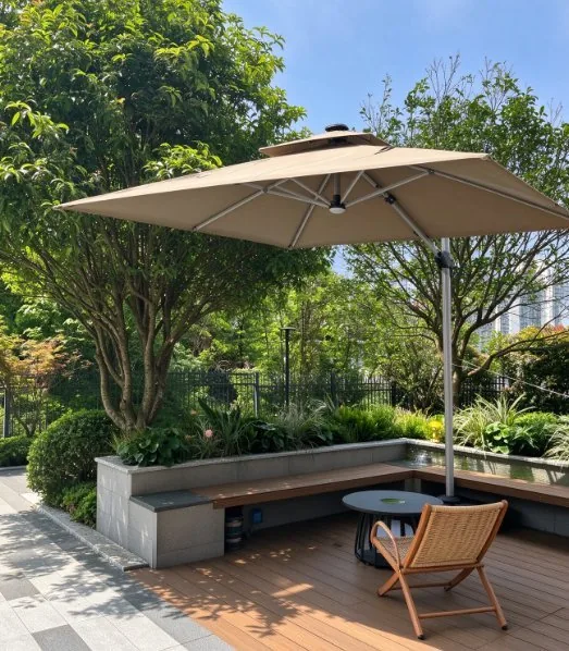
Panel face — the surface a logo is normally centred on
Send us your artwork — we will tell you what it will and will not do
No obligation. The review is free, and an honest answer early is worth more than an optimistic quote.
Ask about this
Tell us the specification, quantity and delivery window. We come back with factory options, MOQ, a sampling plan and an itemised quote — normally within one business day.